
Overview
Senserva was founded in 2018 by networking security expert Mark Shavlik. When we first engaged with the client, the project brief extended beyond designing a visual identity — it included developing the brand name, strategy, and visual system. What follows is a summary of our collaborative process to define and refine the Senserva brand and its supporting assets.
Brand Strategy
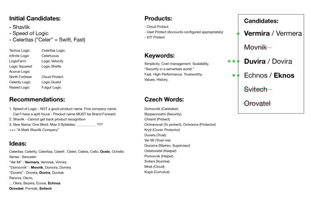
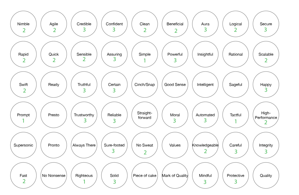
Early in our engagement, we challenged the initial working name, “Speed of Logic”, because it did not effectively communicate the company’s core value proposition. Through structured brand strategy sessions, we determined that the company’s identity should clearly reflect serverless technology and forward-looking innovation.
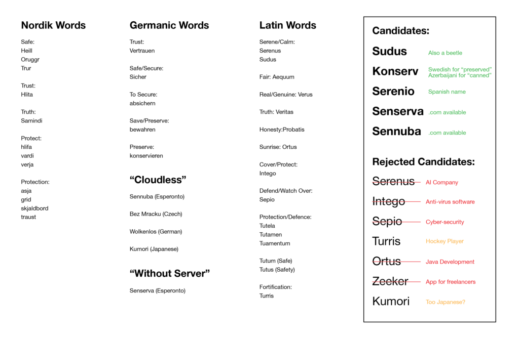
We conducted extensive naming explorations with and without client participation, testing linguistic sources that included the client’s background, geographic context, and conceptual language families such as Latin, Norse, and Esperanto. The aim was to find a unique name that communicated both meaning and market differentiation.
Key Contributions
- Defined the company’s market-ready brand foundation by leading naming, positioning, and identity strategy to clearly communicate Senserva’s serverless value proposition.
- Replaced an unclear working name with a scalable, defensible brand name, improving clarity, memorability, and domain availability across global markets.
- Translated a complex technical concept into a simple, differentiated visual identity, enabling faster comprehension by customers, partners, and investors.
- Delivered a complete, usable brand system (logo, standards, website, and presentation tools) that reduced internal friction and supported consistent execution.
- Positioned the company for growth and credibility at launch, ensuring the brand could scale across sales, marketing, and investor communications without rework.
The Naming Solution
We conducted extensive naming explorations with and without client participation, testing linguistic sources that included the client’s background, geographic context, and conceptual language families such as Latin, Norse, and Esperanto. The aim was to find a unique name that communicated both meaning and market differentiation.
We collaboratively selected Senserva, derived from a modified Esperanto root that translates to “without server.” This choice not only aligned with the company’s serverless focus but also offered universal accessibility and domain availability across extensions, making it highly practical as a brand name. By slightly changing the original word, it’s a true original and therefore able to be trademarked and defended much easier.
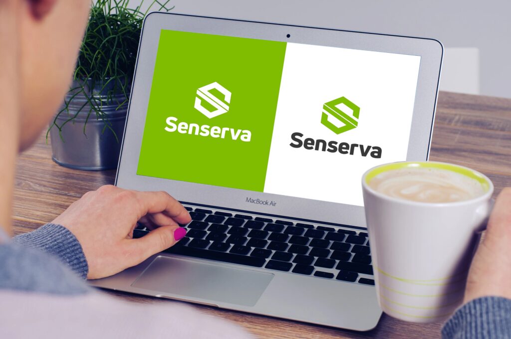
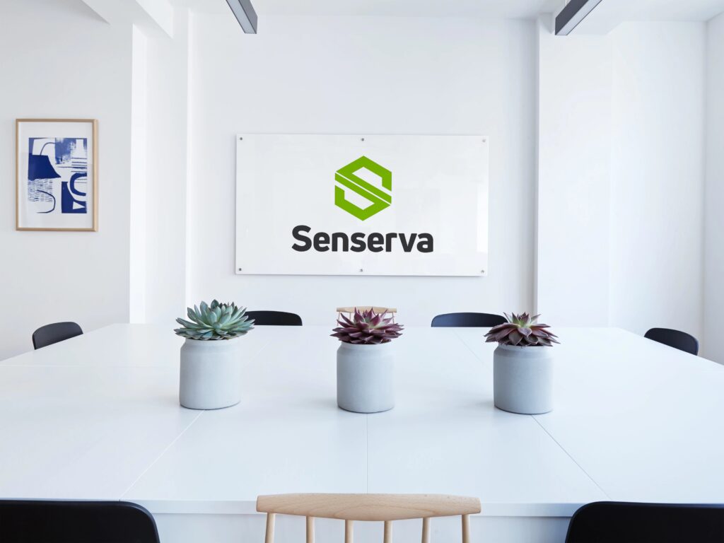
Logo Design
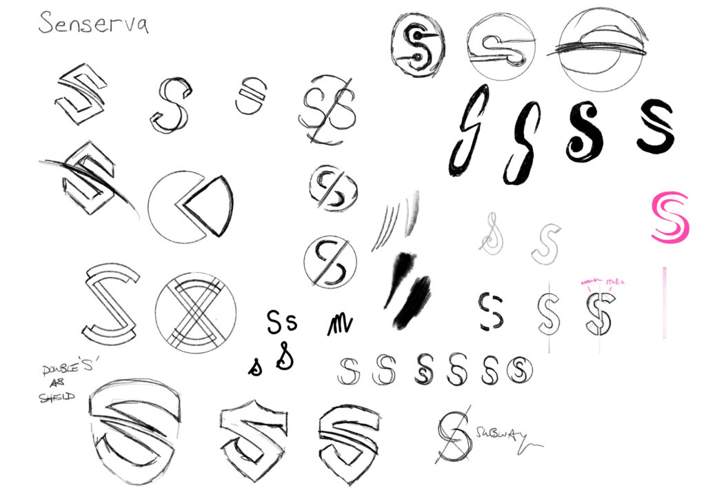
The logo concept needed to visually express the “serverless” paradigm while functioning as a strong, memorable mark.
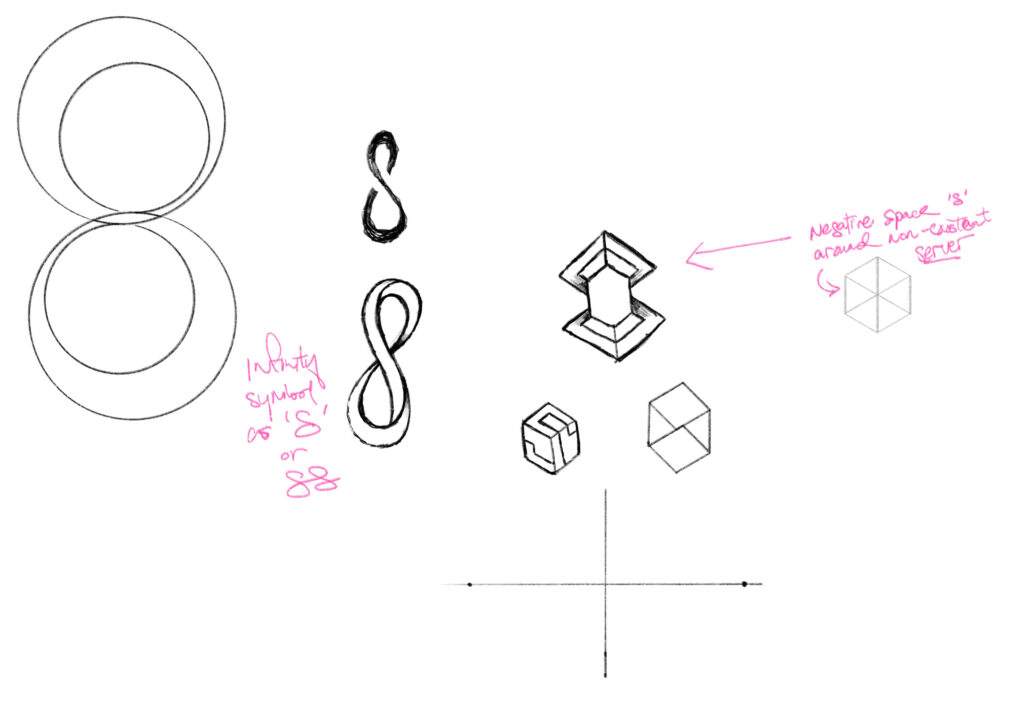
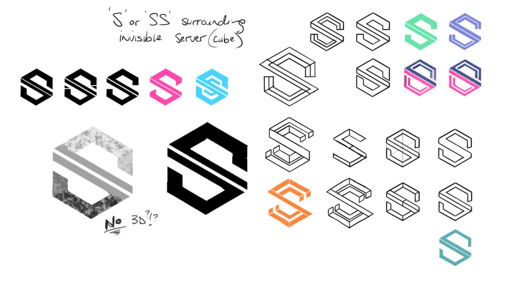
We developed an abstract “S” form that visually suggests folding around an invisible cube — symbolizing the absence of a traditional server.
Through iterative sketching and refinement, we introduced a line within the shape to create an “impossible” form that adds visual intrigue and conceptual depth.
Multiple iterations explored form, dimensionality, and implied structure before arriving at the final approved symbol.

Completing the visual identity
The final design successfully balanced conceptual meaning with visual clarity, and the client approved the mark as a representation that could scale across both digital and print contexts.
Branding Collateral & Deliverables
To ensure a cohesive and flexible brand implementation, we developed a suite of deliverables that supported both internal teams and external stakeholders:
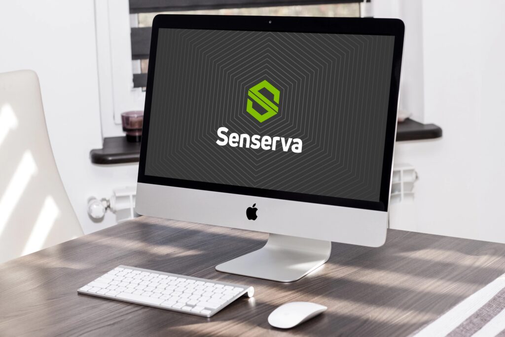
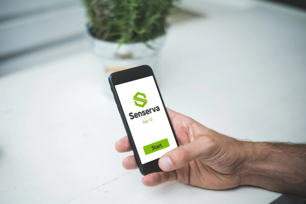
- Logo Kit: A comprehensive set of files (vector and raster), colour variations, and lock-ups suitable for print, web, and social media.
- Brand Standards Guide: A multi-page PDF outlining usage rules, colour systems, typography, and layout principles to ensure consistency across applications.
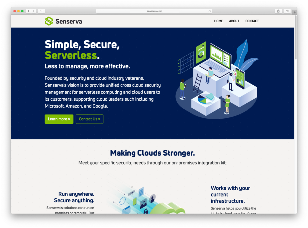
- WordPress Website: A custom site with branded layouts and illustrations tailored to Senserva’s messaging and market positioning.
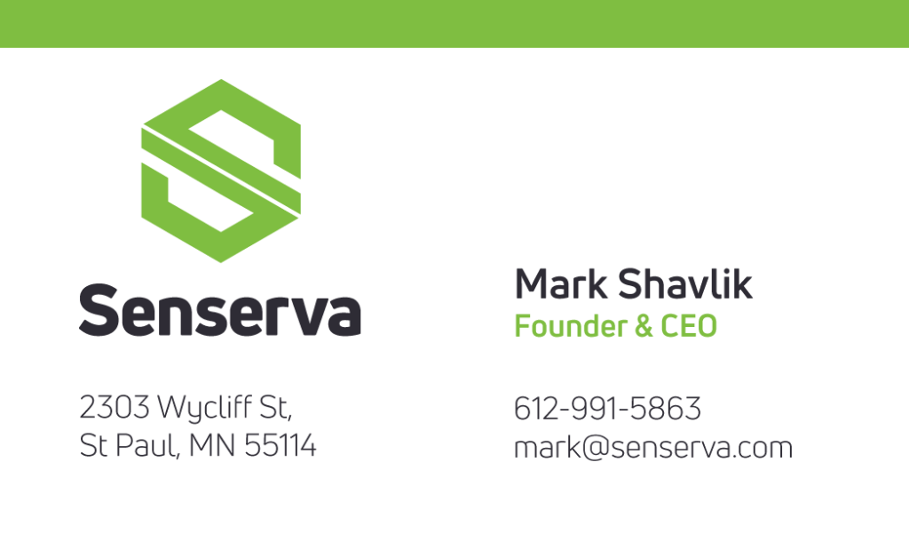
- Business Cards: Designed for both aesthetic impact and practical durability.
- PowerPoint Template: A flexible deck to support sales, investor presentations, and internal communication.
Each deliverable was created with an eye toward scalability, brand cohesion, and ease of use for Senserva’s internal teams.
Outcomes
Our work with Senserva resulted in a fully realized visual identity that:
- Communicates the serverless paradigm in a clear, memorable way.
- Provides a strategic naming foundation that supports long-term brand recognition.
- Includes a comprehensive identity system that enables consistent application across digital and physical touchpoints.
By approaching this project collaboratively, we helped the Senserva team launch with a distinctive brand position and a toolkit that supports future growth.