
Overview
Rook & Knight Law is a Toronto-based firm specializing in commercial and investor real estate law, formed through the consolidation of two existing practices: Cardinal Law and Prosperus Law. Their model is built on long-term, multi-transaction relationships and a posture of proactive judgment; they solve problems before they appear rather than reacting after they do.
Our engagement covered the full scope of the rebrand: strategy, naming, identity, system, and launch-ready collateral. The job was to translate a two-firm merger into a single, defensible brand position that the legal market doesn’t yet occupy.

Brand Strategy
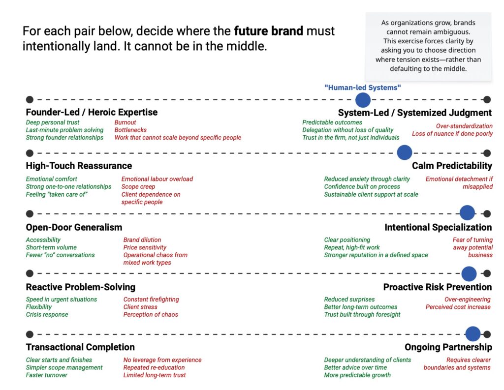
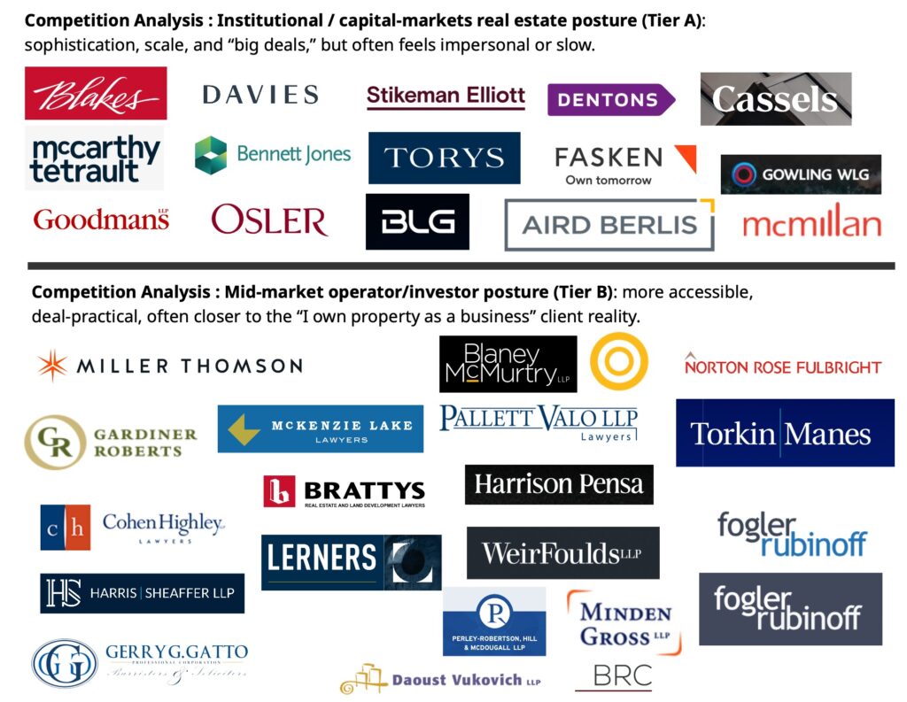
Most legal firms try to look authoritative by looking like every other firm. Serif type, deep blues, crests, columns, scales. BORING!!! That kind of stuff signals competence, but it kills memorability. For a firm whose entire value proposition is built on long-term partnership and preventative thinking, looking like everyone else would have undercut the very thing that made them worth hiring.
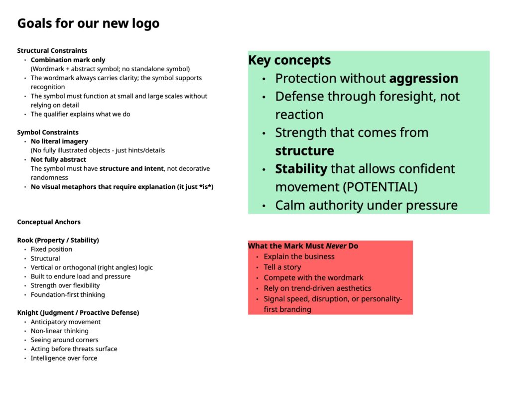
The strategic question was different: how do you brand a firm whose actual product is judgment over time?
The answer came from chess.
The Rook and the Knight are exceptional, specialized pieces. One moves decisively in straight lines. The other is agile and capable of moves no other piece can make. Paired together, they form one of the strongest combinations on the board when paired with almost any other piece. Both work in service of the King or Queen, the lead piece, to deliver the outcome.
That’s the firm’s actual posture: indispensable, exceptional, and always in support of the client’s strategy. From this single insight, the name, mark, voice, and system all followed.
Key Contributions
- Translated a two-firm consolidation into a single, defensible brand built on a strategic position the legal category doesn’t currently occupy.
- Led naming, identity, voice, and systems design end-to-end as the solo strategist and designer, working directly with the founding partners.
- Built a modular logo system with four qualifier variants so distinct practice areas can speak to their own audiences without fragmenting the parent brand.
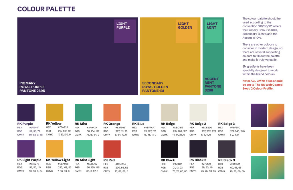
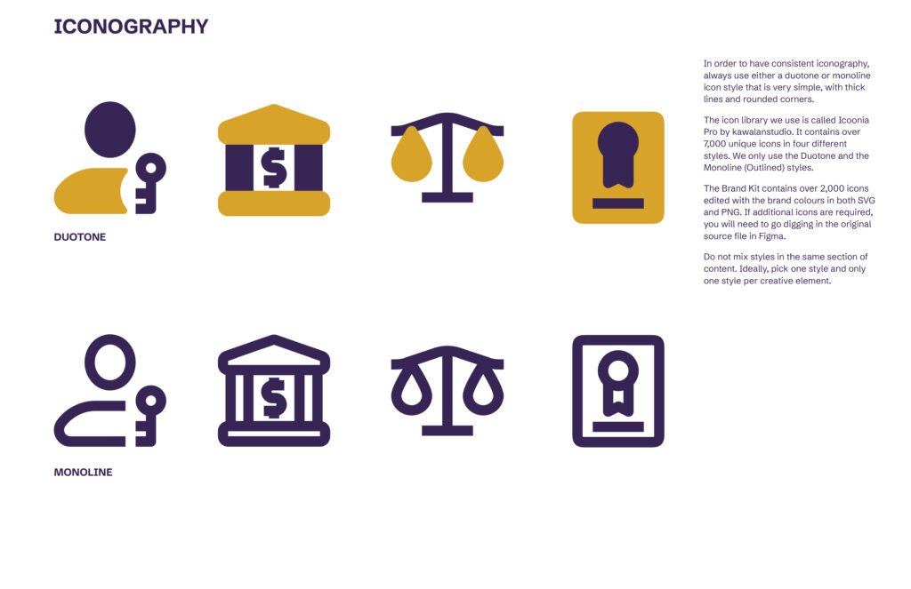
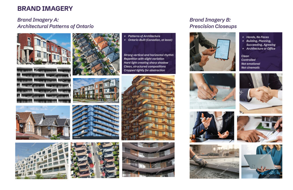
- Developed a complete visual identity including colour, typography, patterns, brand shapes, photography direction, and iconography, engineered to scale across digital, print, environmental, and merchandise applications.
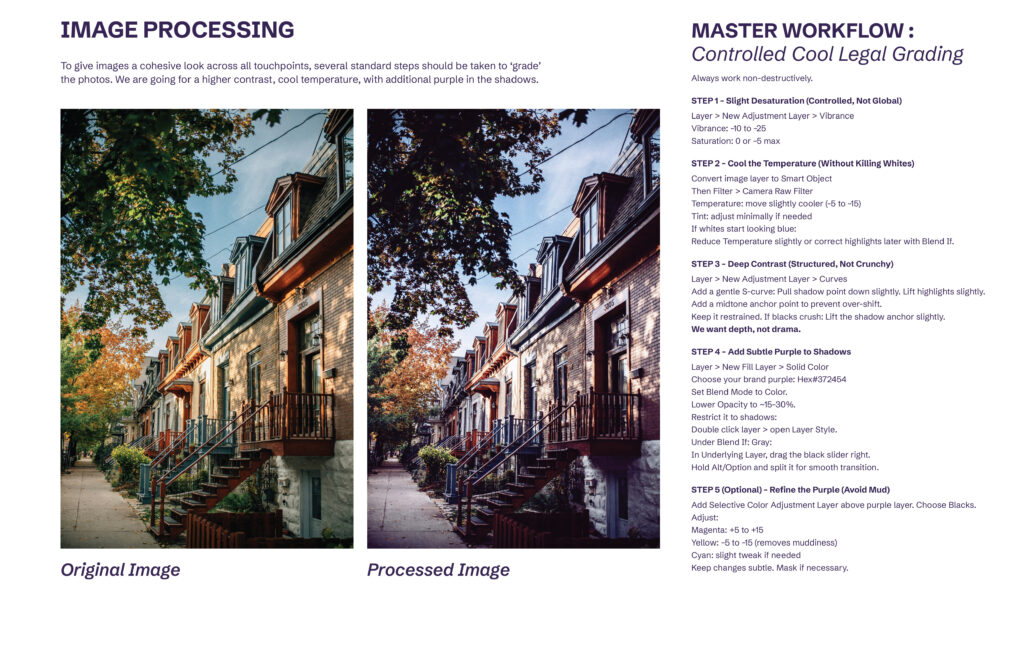
- Documented a custom photography grading workflow (“Controlled Cool Legal Grading”) so the client’s team can produce on-brand imagery in Photoshop without returning to design for every asset.
- Delivered a complete launch package, including a full brand standards document, sample creative, and application mockups ready for production.
The Strategic Position
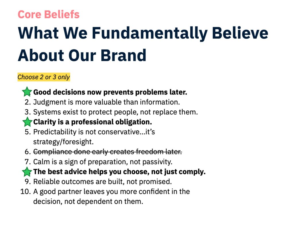
Naming and visuals only carry a brand so far. To give the firm something durable to operate from, we defined three positioning pillars to anchor the voice and the visual decisions across every touchpoint:
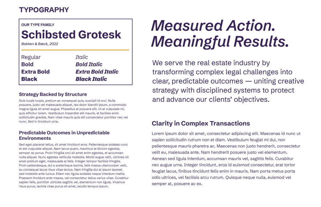
- Strategy Backed by Structure
- Predictable Outcomes in Unpredictable Environments
- Clarity in Complex Transactions
These pillars informed the firm’s tagline: Measured Action. Meaningful Results. Nothing in the brand should feel reactive, dramatic, or salesy, because the firm isn’t. Every visual and verbal decision was tested against that constraint.
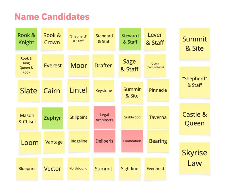
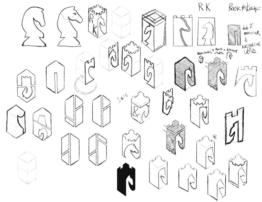
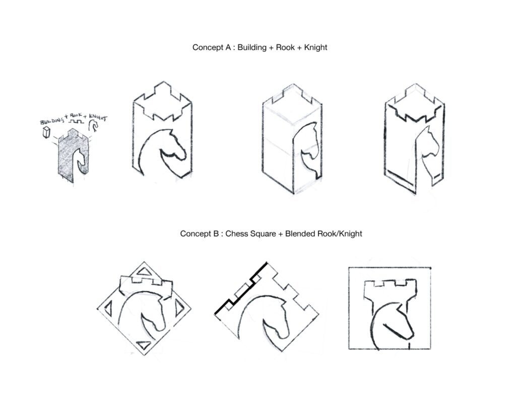
Logo Design
The logo had to do two things at once. It had to combine two distinct chess pieces into a single coherent mark, and it had to step away from the visual clichés of legal branding: no scales, no columns, no gavels, no monograms.
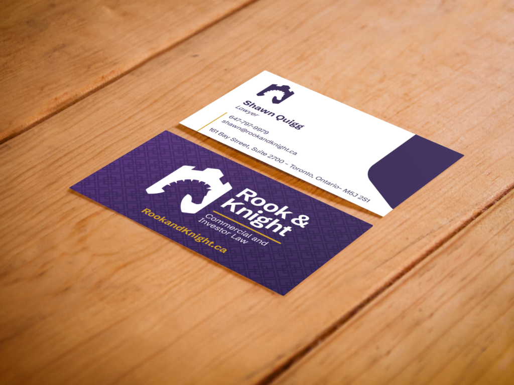
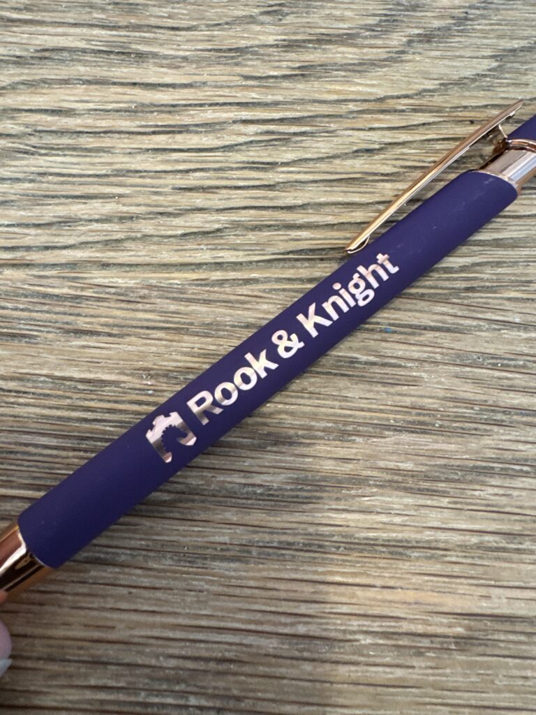
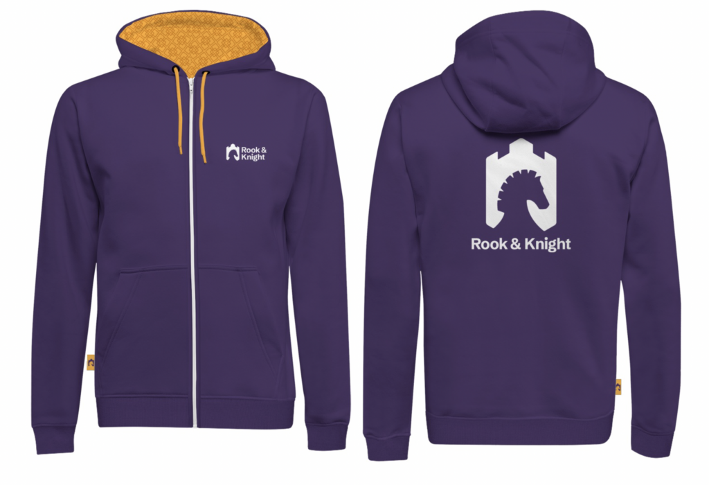
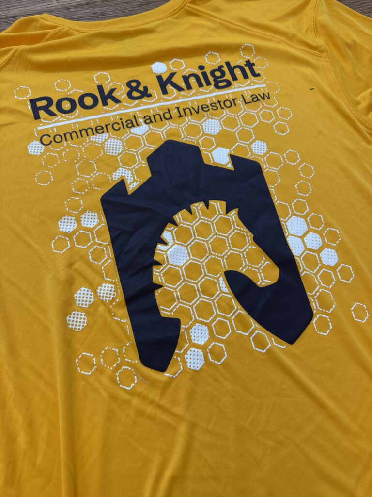
The solution was a silhouette that nests the Knight inside the Rook. The agile piece is framed and protected by the decisive one; the pairing is expressed as a single form. At small sizes, the mark reads as one shape. Up close, both pieces become visible. The crenellations across the top of the Rook double as the measurement unit for safe-distance rules in the brand standards, making the geometry internally consistent down to the mechanics of usage.
The Wordmark is set in Schibsted Grotesk, a modern grotesque with the technical confidence of a contemporary practice and none of the staid formality of traditional legal type. The gold line between the wordmark and the qualifier serves as both a visual divider and a small, repeatable brand signature that carries through the system.

Brand in Application
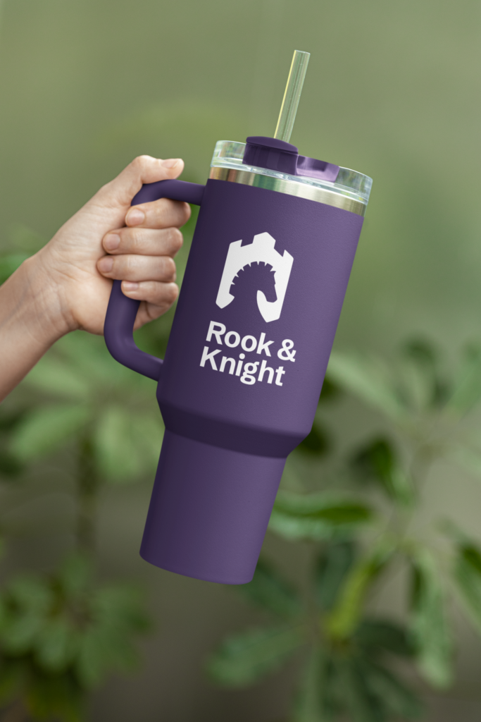
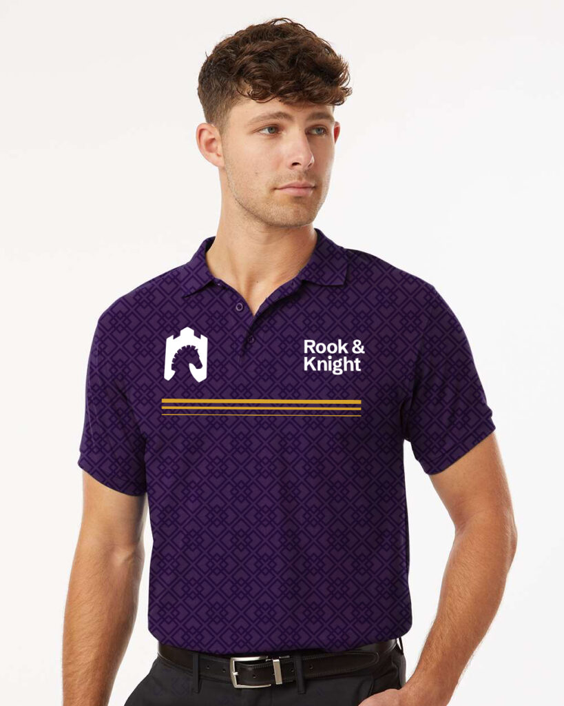
The launch package included a complete brand standards document and a library of sample creatives demonstrating how the system performs across real-world touchpoints: business cards, social posts, billboards, apparel, signage, and promotional merchandise.
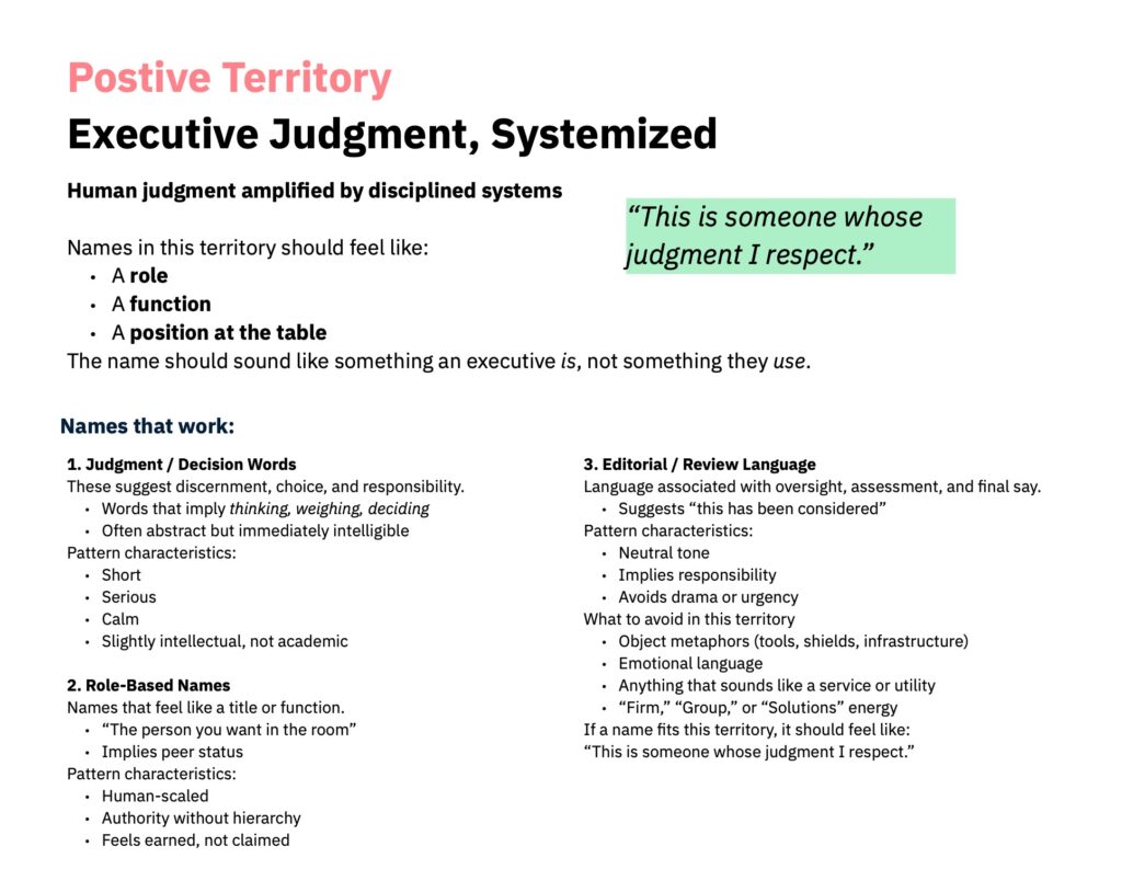
The resulting brand conveys authority and judgement without being loud or overstated. We’ve successfully avoided the “Smith & Smith Law” and the made up word tropes, creating a business name that fully reflects the soul of the brand: Executive Judgement, Systematized.

Outcomes
By the end of the engagement, Rook & Knight had:
- A unified brand that resolved the strategic complexity of a two-firm consolidation under a single, defensible position.
- A modular system that lets four practice areas speak distinctly without fragmenting equity.
- Brand standards and workflows that allow internal teams to produce on-brand work without designer dependence.
- A strategic position built on how the firm actually practices law (long-term partnership, proactive judgment, measured action) rather than on category conventions.
The brand is now live at RookandKnight.ca and on social media. We are supporting the firm’s positioning as a long-term strategic partner across real estate, lending, business, and investor practice.